A couple years ago, I presented an introduction to the Wilcoxon-Mann-Whitney nonparametric test with respect to identifying whether scoring was indeed increasing in the NBA. This was in 2015; and now that we are a few seasons along, we can start tracking the year-to-year trends. The reason for this popping up once again is primarily due to the frenetic pace of games to start this 2018-19 NBA season. However, we always say that perception is always not reality. In order to suggest that scoring is indeed up, we have to present a statistical test and construct a mathematically sound decision boundary. If we don’t do this, then we are just looking for faces in clouds.
In this article, we will break down how to perform such a test. The nuts and bolts of the test are given in the link above, so I won’t inundate you with repetitive material.
Is Scoring Really Up?
This question is almost seemingly answered YES! across the board. It may be one of those years where it seems obvious that scoring is indeed up. But let’s take a look at the trend over the years.
To start, we look at scores posted from the 2010-11 season through this season. That’s a total of 8 complete seasons and this current partial season. To capture scores, I just go to one of my favorite score repositories: Ken Massey’s Data page. Scores are outlined in a very precise way, and if you copy and paste his scores into a text file, you’ll be able to run code found on this page quite easily.
The first thing we do is read the text files in and create a scoring dictionary. The scoring dictionary just associates the collection of scores for each season. Later on, we will be able to call the season and have all the final scores at our disposal.
years = ['2011','2012', '2013','2014','2015','2016','2017','2018','2019']
scores = {}

for dirName, subdirList, fileList in os.walk(inDir):
    print('Found directory: %s' % dirName)
    for fname in fileList:
        if fname[0:4] in years:
        	if fname[4:] == '.txt':
        		print('\t%s' % fname)
        		# We have a year's worth of data!
        		f = open(inDir+'/'+fname,'r')
        		lines = f.readlines()
        		f.close
        		scores[fname[0:4]] = []
        		for line in lines:
        			scores[fname[0:4]].append(float(line[36:39]))
        			scores[fname[0:4]].append(float(line[65:68]))
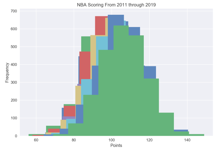
Ideally, we would plot the histograms for each season layered on top of one-another. This would give us a decent illustration of how scoring is changing.
plotRange = np.linspace(70,150,1000)
for year in range(2012,2020):
	plt.hist(scores[str(year-1)])

plt.title('NBA Scoring From 2011 through 2019')
plt.xlabel('Points')
plt.ylabel('Frequency')
plt.show()
However…

Histogram of scoring across the league from 2011 through 2018.
It appears there’s a slight shift forward, indicating scoring is increasing… but the way the histograms are presented obfuscates the year-to-year interaction. Even though the years are stacked on top of each other, can we tell the difference (at least visually) between what happened in 2011 and 2012? To help aid with this, we can look at the kernel density estimator.
x_grid = np.linspace(60, 150, 1000)
bandwidth = 0.2
alphs = np.linspace(.5,1.0,10)
i=0
for year in range(2011,2020):
	kde = gaussian_kde(np.array(scores[str(year)]))
	est = kde.evaluate(x_grid)
	plt.plot(x_grid, est, alpha=alphs[i], lw=3,label=year)
	plt.legend()
	i += 1
plt.title('NBA Scoring From 2011 through 2019')
plt.xlabel('Points')
plt.ylabel('Frequency')
plt.show()
The kernel density estimator is a weighting technique that places a weight at each data point. Usually, the weight is a Gaussian amount; but it can be other things like a top-hat or an Epanechnikov. If we apply the Gaussian weighting and then color the years with a decaying transparency to offset the colors; we obtain a much more readable graph:

Comparison of scoring distributions between 2011 and 2019 NBA seasons.
And it’s here that we are able to finally see the pattern of scoring over the years. In fact, it appears that the 2011-12 and 2012-13 NBA seasons witnessed a decrease in scoring. Similarly, the 2016-17 and the 2017-18 NBA seasons appear to be almost identical when it comes to scoring. Similarly, there seems to be a foundational shift in scoring between the 2015-16 and 2016-17 NBA seasons; as well as the 2017-18 and current NBA seasons. The latter has been hypothesized to be due to the freedom of movement and shot clock adjustment rules established during the off-season; as well as a dramatic increase in pace of play.
So let’s test this out using the nonparametric test.
for year in range(2012,2020):
	[stat, pval] = mannwhitneyu(scores[str(year-1)],scores[str(year)],alternative='less')
	print(year-1, year, np.mean(scores[str(year-1)]),np.std(scores[str(year-1)]), np.mean(scores[str(year)]),np.std(scores[str(year)]),stat, pval)
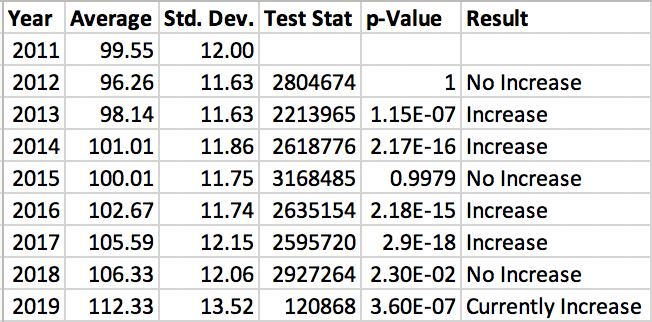
Applying a Wilcoxon-Mann-Whitney test is easy thanks to the built in packages of Python. All we need to do as a statistician is to confirm whether we have hit all the requirements of the test. In this case, a Wilcoxon-Mann-Whitney requests that the two samples we are interested in are independent. We can argue that they are as one season’s scores does not give you information about the next season’s scores. However, there is an underlying dependent structure as we can use tools such as RAPM to predict ratings given lineups, and the lineups don’t change much from year to year.
So we cheat a little and, for the sake of argument, suppose they are indeed independent. It’s actually fairly low noise, and as you will see, that barely impacts the results of the test.

Year-to-Year comparison for scoring within the NBA from 2011 through 2019.
Notice I made a decision on the 2017-18 NBA season to suggest there is no increase in scoring. This is one of those situations were we need to understand the significance of a p-value. In graduate and undergraduate school, we learn of the five-percent rule. However, in industry, the five-percent rule almost never applies. Instead, we attempt to understand what makes sense for decisions relative to the process. In some engineering studies, p-values of .3 are “good enough” to suggest a significant effect. Whereas, in our study above, we really should be looking at something close to .00001. At that point, .023 just isn’t going to cut it.
Another note to make is that despite scoring being up this year, it’s nothing in comparison to the jumps in the 2013-14, the 2015-16, and the 2017-18 NBA seasons. We should be a little cautious, as this may be due to sample size. And if the season pans out in a uniform fashion to its first month, we may see the biggest change yet!
But the question is to identify if pace is the root cause of this. The simple answer is to look at the offensive ratings.
Are Offenses Scoring More Efficiently?
We pose this problem as an efficiency problem. If a team’s scoring is up and it is due to pace, then we would expect the offensive ratings to either stay the same or decrease while points per game goes up. The simple ratio of
Points Scored = Offensive Rating x Total Possessions / 100
computes the points scored given an offensive rating. Under this, if pace increases, then the number of possessions increase. If ratings stay the same (or decrease), then pace dictates the number of points scored.
So we can first test if the offensive ratings are increasing. To test this, we can simply draw each team’s ratings over the course of each season. To do this, I simply compiled a csv file of offensive ratings from Basketball Reference. In this case, we have a table of teams by seasonal offensive ratings. To break this file up, we call on the pandas package in Python.
data = pd.read_csv(inFile)

print data['2011 ORTG'].values
x_grid = np.linspace(80, 130, 1000)
bandwidth = 0.2
alphs = np.linspace(.5,1.0,10)
i=0
for year in range(2011,2020):
	key = str(year) + ' ORTG'
	kde = gaussian_kde(np.array(data[key].values))
	est = kde.evaluate(x_grid)
	plt.plot(x_grid, est, alpha=alphs[i], lw=3,label=year)
	plt.legend()
	i += 1

plt.title('NBA ORtg From 2011 through 2019')
plt.xlabel('Rating')
plt.ylabel('Frequency')
plt.show()
The results are promising…

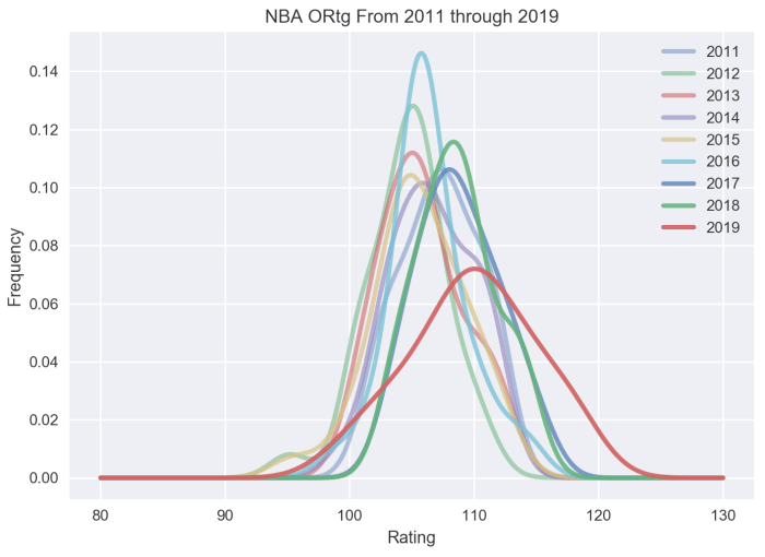
Comparisons of the Offensive Ratings between the 2011 and 2019 NBA seasons.
From this plot, we actually see (visually) that the efficiency of teams decrease from the 2010-11 season into the following two seasons. However, the 2013-14 season witnesses an odd bump, primarily due to the Dallas Mavericks and the Portland Trail Blazers that season. Afterwards, the 2014-15 NBA season bounces back to par with the lower efficient seasons before we see the 2015-16 NBA season return to as efficient levels as the 2010-11 season. This relationship indicates that pace increased in the 2012-13 season and is a primary culprit in the increase of scoring.
We once again witness the jump in efficiency for the 2016-17 NBA season, which is nearly replicated in the 2017-18 NBA season. This jump indicates that its not necessarily pace, but more likely a combination of pace and efficiency; as this was the real introduction to the three-point mentality for teams.

Wilcoxon-Mann-Whitney Tests on adjacent years between the 2011 and 2019 NBA seasons.
Performing the Wilcoxon-Mann-Whitney tests, we see there is a clear drop between the 2011 and 2012 NBA seasons. NOTE: The test above does not test this; I concluded this by re-running the test with ‘greater’ selected as the alternative option.
for year in range(2012,2020):
	key = str(year) + ' ORTG'
	key1 = str(year-1) + ' ORTG'
	[stat, pval] = mannwhitneyu(np.array(data[key1].values),np.array(data[key].values),alternative='less')
	print(year-1, year, np.mean(np.array(data[key1].values)),np.std(np.array(data[key1].values)), np.mean(np.array(data[key].values)),np.std(np.array(data[key].values)),stat, pval)
But more importantly, we see there is effectively no progressing change in efficiency until the 2016-17 NBA season. Thank you, space-and-pace revolution. With only approximately 50 games into the current season, the small p-value is debatable on whether we have increased efficiency this season. It’s a gathering storm of yes, but the significance just isn’t quite there.
The takeaway here is that if we say not enough evidence to suggest efficiency has increased, then pacing is indeed the prime culprit for increased scoring.
That said, the next question in order is… how long can these paces keep up over the season?
Pingback: Weekly Sports Analytics News Roundup - October 30th, 2018 - StatSheetStuffer
Pingback: Is Scoring Up (Again) in the NBA? — Justin Jacobs breaks down: Understanding Basketball Analytics | Advance Pro Basketball
Pingback: Is Scoring Up (Again) in the NBA? — Squared Statistics: Understanding Basketball Analytics – Advance Pro Basketball